
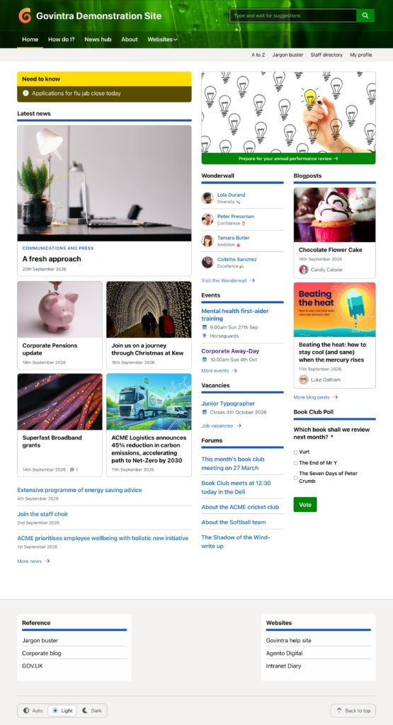
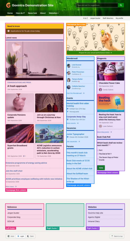
The homepage is built entirely from widgets. The Home page template prints five widget areas, and the footer, which is on every page, has three more. Fill them under Appearance, Widgets, which is the classic drag-and-drop widgets screen; the theme turns off the block-based one. Drag a widget from the left into an area on the right, open it to set its options, and select Save.
The homepage itself must be a page that uses the Home page template and is chosen as the static homepage under Settings, Reading. See Home template for its emergency and campaign messages.
The homepage widget areas
On a desktop screen the homepage is two equal halves under an optional full-width strip. The left half is one tall column; the right half has a hero area across the top and two narrower columns beneath it. On a phone everything stacks in this order:
- Homepage full-width: across the whole width, above the columns. Use it for something everyone must see, such as a banner, a row of news updates. Leave it empty and the columns start at the top.
- Homepage first column: the left half. The main content: news, need to know, blog posts.
- Homepage hero area: the top of the right half, as wide as the two columns below it. Good for an intravert or a large call to action.
- Homepage second column and Homepage third column: side by side under the hero. Shorter widgets: events, most recent, how do I, vacancies, quick links.
An area that has no widgets is not printed, so the layout closes up around what you use. If the hero and both small columns are empty, the first column still keeps to the left half.
The footer widget areas
- Footer Left: the wide left part of the footer. Custom menus placed here run inline. The Feedback widget belongs here if you collect feedback with Gravity Forms.
- Footer Right 1 and Footer Right 2: two narrow columns. A Navigation Menu widget here shows as a list, which suits an “About this site” menu, and the About this page widget gives the page’s author and last update.
A starting arrangement
- First column: (Govintra) Need to know, then (Govintra) News, then (Govintra) Blog posts.
- Hero area: (Govintra) Intraverts.
- Second column: (Govintra) Events and (Govintra) Most Recent.
- Third column: (Govintra) How Do I and (Govintra) News updates, or a poll.
- Footer Left: (Govintra) Feedback. Footer Right 1: (Govintra) About this page. Footer Right 2: a Navigation Menu widget.
Every widget has a title box. Most Govintra widgets show their own default heading, such as “Events” or “About this page”, when it is left empty; type a title to change it.
Which widgets you will find
The theme’s own widgets are all prefixed “(Govintra)”: About this page, Blog posts, Events, Events Calendar, Feedback, How Do I, Intraverts, Leaderboard, Most Liked, Most Recent, Need to know, News, News updates, Profile Nudge, Recent Comments, Vacancies and the wall widget. Some only appear when what they need is switched on: How Do I needs the Tasks module, Profile Nudge the Staff directory, the wall widget the Wonderwall module (it takes the wall’s name), Most Liked needs Enable likes on the Options, General screen. Events Calendar is always listed but shows nothing unless The Events Calendar plugin is active. Each is described under Available widgets.
More widgets come from the Govintra plugins: A to Z, Favourites, Notify, Most active, Popular links and Services. WordPress’s own Navigation Menu, Text and Custom HTML widgets work in every area too.
The same widget can be used more than once, in different areas or in the same one, with different settings each time, for example two News widgets showing two news types. Other pages have their own areas, such as the news and task landing pages, the page sidebars and the search results sidebar; the same screen fills those.