
The Each line is label, then link, then image, separated by a vertical bar. The label is required. Leave out the image for a plain text tile, or leave out the link for a tile that is not clickable. Links can be a page address on the intranet, starting with a slash, or a full web address. Images are the address of a file in the Media Library: open the image in the library and copy its File URL. You can type the lines in the Visual tab; line breaks and paragraphs between tiles are read as new lines. Any other formatting inside the shortcode is removed. The number of tiles across on a wide screen: The shape of the images, as width to height. A grid of tiles in the order you listed them. A tile with an image shows the picture with the label beneath it; a tile without one shows the label alone. A tile with a link is clickable across its whole face. Tile images are treated as decoration, so the label must say what the tile is: do not rely on words in the picture. For images, choose pictures with the same shape and a clear subject in the middle, so the crop looks even across the grid. Any image size from the Media Library works; the theme sizes the file to the tile. Three square tiles for the main sections of a directorate page: Two wide tiles with no images, as large buttons:shortcode turns a short list of links into a grid of equal-height tiles, each with a label, a link and, if you want, an image. Use it for the quick links on a landing page, a row of team or topic tiles, or anywhere you would once have built a table of pictures and links. The grid keeps its shape on every screen size and there is no layout code for editors to break.
Add the cardgrid shortcode
In the editor toolbar select the shortcode button, choose Card grid, pick the number of columns and, if you want, an image shape, then select Insert. The shortcode is placed in the page with two example lines between its opening and closing tags. Replace them with your own tiles, one per line:
[cardgrid cols="4"]

Annual leave

Expenses
IT help
Staff directory
Attributes of cardgrid
cols
2, 3 or 4. The default is 4. On a phone the tiles stack in one column, and on a small tablet they sit two across, whatever you choose.ratio
1/1 gives square tiles, 3/2 landscape, 16/9 wide. Leave it out to use the theme's card image shape, which is 3:2 unless your site's card image ratio option changes it. Images are cropped to the shape, so the middle of each picture is what shows.What cardgrid shows
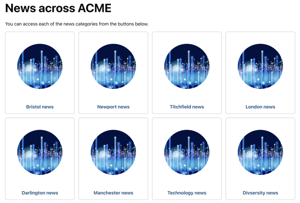
Examples of cardgrid
Related
Find available shortcodes


