
News updates are short, categorised announcements such as “Email is running slowly”, “Lift out of order in Building 3” or “Payroll cut-off moved to the 20th”. They are separate from news stories: they have their own menu, their own listing page, their own types and their own widget, and they never appear in the News widget or on the News page. Use news updates for operational notices that staff need to scan quickly, and news stories for articles people read.
Switch on the News updates module
An administrator does this once.
- Go to Options, then Modules, and switch on News updates. Select Update. A News updates menu appears in the left-hand menu, with a flag icon.
- Add a new page, call it something like News updates, and set its template to News updates listing. Publish it.
- Go back to Options, then Modules, and open the News updates tab, which appears once the module is on. Choose that page as the News updates page. The intranet uses it for breadcrumbs, for the “More updates” link in the widget and for the type links in the sidebar of each update.
- Add the page to a menu, and place the (Govintra) News updates widget where staff will see it, usually on the homepage.
See Module settings and options for the rest of the Modules screen.
Expiry settings for all news updates
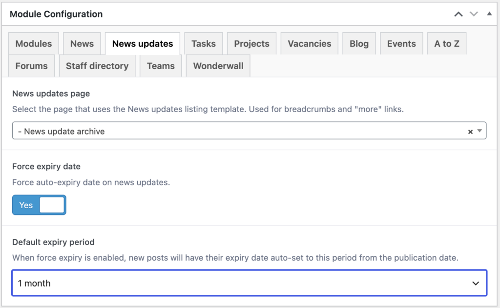
Two more settings sit on the News updates tab of Options, Modules. Both are off or empty by default.
Force expiry date
When on, every news update must have an expiry. Auto-expiry is switched on for new updates and cannot be switched off, and an update cannot be saved without an expiry date. Use it to stop old notices lingering.
Default expiry period
Appears when Force expiry date is on. Choose None, 1 month, 2 months, 3 months, 6 months, 1 year, 2 years or 5 years. When a period is chosen, a new news update gets its expiry date filled in automatically the first time it is saved, counted from its publication date, with the time set to 09:00 and the action set to Revert to draft. The author can change any of these before publishing.
News update types and their icons
Types are how news updates are categorised: IT updates, Building updates, Health and safety and so on. Go to News updates, then News update types. Types can have sub-types beneath them. Each type has an icon that appears next to its updates in the widget, on the listing page and in the type filter.
- Icon: the Font Awesome icon name without the fa- prefix, such as computer, bus or building. The default is flag.
- Icon style: Solid (the default), Regular, Light, Duotone Solid, Duotone Regular, Duotone Light or Brands. The style must be one that is switched on under Options, General, Font Awesome variants, or the icon will not show.
- Icon colour 1 and Icon colour 2: appear for the three Duotone styles only. Colour 1 is the main layer and colour 2 the tint, each with an opacity slider. Leave them blank for the theme’s duotone colours.
Only administrators can add or change types. See News update types.
Add a news update
In the left-hand menu select News updates, then Add news update. The edit screen is simpler than a news story: there are no post formats. The Sidebar content and Related content boxes are new in the latest theme, so older installations do not have them.
- Title and content: keep the title specific, because it is what appears in the widget. The content can be a sentence or a full page.
- News update types: tick one type, or more. On the listing page an update shows under every type it has.
- Tags: optional, shared with the rest of the intranet.
- Featured image: optional. It appears at the top of the update’s own page and on the cards on the listing page. See Set a featured image.
- Excerpt: optional summary, used on the listing page cards and in search results.
- Documents: attach files for download at the foot of the update, each with an optional display title.
- Keywords: extra words for search that are not already in the title or content.
- Discussion: comments are open on new news updates when Settings, Discussion allows comments on new content. Untick Allow comments to close them for this update.
Auto expiry
In the right-hand column. Switch Auto-expiry on to show the rest of the box. Set the Expiry date and the Expiry time (24-hour, such as 17:30; leave it blank and the update expires at the start of that day). Choose the Expiry action:
- Revert to draft: the default. The update comes off the intranet but is kept, so you can reuse it.
- Move to trash: the update goes to the Bin.
- Change type: the update stays published but moves to the type you choose in Change to type, replacing its current types. Useful for moving a live alert into an archive type.
Expiry is checked every five minutes. Once it has happened, the expiry fields are cleared, so republishing a drafted update does not expire it again.
Contributors can write news updates but not publish them. Authors can publish and edit their own. Editors and administrators can publish, edit and delete any update. Your intranet may have changed these roles.
What staff see on a news update page
A news update page is a news story page without the extras: no format options, no video player and no row of similar updates at the foot. From the top down:
- The breadcrumb trail: Home, the News updates page, then the title. A draft or scheduled update carries its preview badge here when previewed.
- The title and the published date. The author is not shown.
- The featured image at the large size, with the caption from its Media Library entry underneath if one is set.
- The content, the Documents list, then the like button if an administrator has ticked news updates under Likes post types.
- The sidebar: Sidebar content and the Related list, both new in the latest theme, then widgets from the News Update Sidebar area, then pills for the update’s types and tags. A type pill opens the News updates page filtered to that type; a tag pill opens the tag’s archive limited to news updates.
- Comments, when they are open on the update.
The icon set on a type’s settings screen appears in the widget and on listing cards, not on the update’s own page, where the type is shown by name in its sidebar pill.
The Related list shows what you picked in Related content, plus any item elsewhere on the intranet that lists this update in its own Related content, unless Hide reciprocal related links is on under Options, General. Pick one or two linked tasks: an update such as “Email running slowly” is a good place to point to the task on reporting IT problems.
Where news updates appear
- The News updates page: newest first, with a row of pills across the top for All and each top-level type. Selecting a type filters the list and, if the type has sub-types, shows a second row of pills for them. On the All list each card shows the update’s type. The page uses the “Blog pages show at most” number from Settings, Reading for paging.
- The News updates widget: a compact list with the type icons, in a plain or coloured style, filtered to chosen types if you wish, with pinned updates at the top.
- The Comms hub template: lists news updates as a band or section alongside news and blog posts, and can put them first. See Comms hub template.
- Search: a News updates filter button appears on the results page while the module is on.
- The update’s own page, described above.
Related
- Add or edit a news story: the fuller edit screen for news.
- Save, preview, schedule and publish pages and posts.