
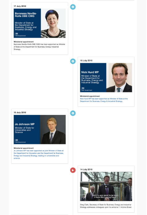
Create a timeline page
- Install and activate the (Govintra) Timelines plugin.
- Add a new page, or edit an existing one.
- In the Page Attributes box, set Template to Timeline. A Timeline box appears under the editor, and a Timeline options box in the right-hand column.
- Optional: write an introduction in the main editor. It appears above the timeline.
- In the Timeline box, select Add another item for each step and fill in its options, described below.
- Optional: in Timeline options, switch on Show colour filter.
- Select Publish or Update.
A timeline page has no sidebar. The page’s title, your introduction and the timeline fill the width of the page.
Options for each timeline item
Title
The heading of the card, such as “2019: The intranet launches” or “Week 1: Meet your team”. You can leave it empty, and the card shows its content only.
Content
The body of the card. This is a full editor, so you can use paragraphs, lists, links, images and video. Keep each card short. A timeline works when staff can take in each step at a glance; put the detail on a linked page.
Icon
The icon shown in the coloured circle beside the card. Type the name of a Font Awesome icon, such as flag, star, calendar, users, rocket or trophy. Leave it empty and a flag is used. If you type a name that does not exist, the circle is empty, so check the icon on the page after you save. See Add icons to content for how to find icon names.
Colour
The colour of the circle. Choose Light blue, Dark blue, Red, Orange, Green or Grey. Dark blue is your intranet’s own brand colour, so it may not be blue at all. Grey matches the intranet’s secondary text colour. The other four are fixed.
Use colour to mean something. For example, green for things that are done, orange for things under way and grey for things still to come; or one colour for each strand of a programme. Staff can only filter the timeline by colour, so a colour that means something makes the filter useful.
Change the order of items, or remove one
Each item in the Timeline box has a number at its left. Drag an item by its number to move it up or down. Items appear on the page in the order they are in the box, from the top. To remove an item, hold the pointer over its number and select the minus sign. Select Update when you have finished.
Show colour filter
Switch this on in the Timeline options box to show a row of buttons above the timeline: Show all, then one button for each colour you have used. Selecting a colour hides every card of the other colours. Selecting Show all brings them back.
The button for each colour shows the icon of the first item of that colour, so give all the items of one colour the same icon, and the buttons then work as a key. If you use only one colour, the filter has nothing useful to do, so leave it off.
How the timeline is laid out
- On a wide screen the cards alternate, the first on the left of the centre line, the second on the right, and so on down the page.
- On a phone the line moves to the left edge and every card sits to its right, in the same order.
- The cards follow dark mode.
Tips for a good timeline
- Put the dates in the titles, so that staff can scan the page by date.
- Keep to one idea per card, and keep cards short.
- Use three or four colours at most, and say what they mean in your introduction.
- Use the same icon for all the cards of one colour.
- For a long history, consider one timeline page per decade or per programme, linked from a landing page, rather than one page with fifty cards.