
The customiser is where you set how your intranet looks: the logo, the brand colours, the header and footer, and any extra CSS. You see each change in a live preview of the intranet as you make it, and nothing changes for staff until you select Publish.
Go to Appearance, then Customise. Only administrators can use it.
The customiser has these sections. The first four are described on this page. The rest are standard WordPress, with a note on how the theme uses them.
- Site Identity: logo, site title, tagline and site icon.
- Brand Colours: the five colours used across the intranet, and the widget accent border.
- Header: header colour, what appears beside the logo, logo size, and background images.
- Footer: footer colour and background images.
- Menus, Widgets, Homepage Settings and Additional CSS.
Use the customiser
- Go to Appearance, then Customise. The settings are on the left and a preview of the intranet on the right.
- Open a section and change a setting. Colour, image and size changes appear in the preview straight away. A few settings, such as showing the site title or tagline, reload the preview.
- Use the preview like the real site. Select a link in it to check another page, and use the desktop, tablet and phone buttons at the bottom left to see each size.
- Select Publish to make the changes live. To save without publishing, select the cog next to Publish and choose Save Draft, or Schedule to publish at a set time. Share Preview Link gives you an address that colleagues can open to see the unpublished changes.
Select the X at the top left to leave. If you have unpublished changes, the customiser asks whether to keep or discard them.
Site Identity
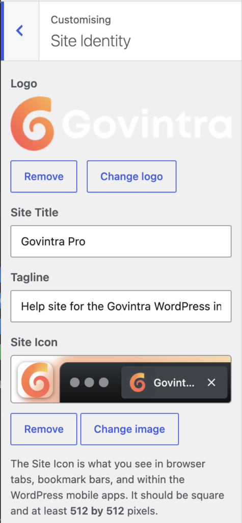
- Logo: select an image from the media library, or upload one. Use a PNG or SVG with a transparent background if you can, because it sits on the header colour. An image about 400 pixels wide and 240 high is a good size, but any shape works. How tall the logo appears is set by Logo height in the Header section. On a phone the logo scales down to fit.
- Site Title: the name of the intranet. It appears in the browser tab, in search results and in emails the intranet sends. It only appears in the header if you tick Show site title alongside logo in the Header section, or if there is no logo.
- Tagline: a short line under the logo, shown only if you tick Show tagline in the Header section. Leave it blank if you do not use it.
- Site Icon: the small square image shown in browser tabs, bookmarks and on a phone’s home screen. Upload a square image at least 512 pixels wide. It should still be recognisable at 16 pixels, so use a simple mark rather than the whole logo.
The logo on the login screen is a separate setting. See General intranet options.
Brand Colours
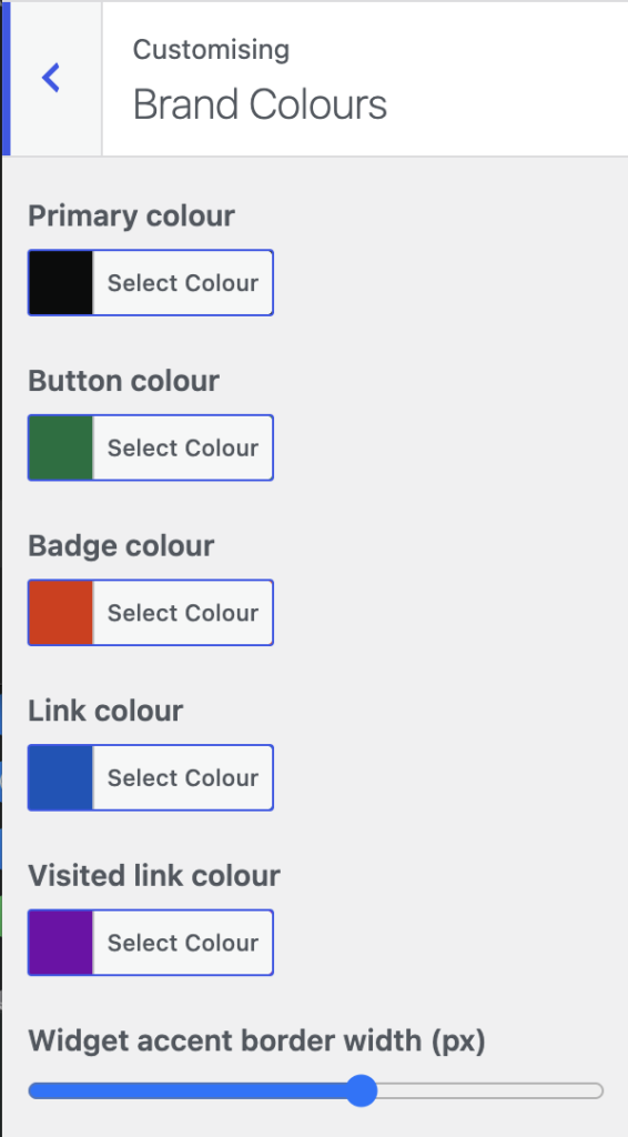
These five colours are used throughout the intranet. Change one and every use of it changes.
- Primary colour: your main brand colour. It is used for the coloured line under widget titles, for category and content type labels, for the current item in menus, for the headers of the Need to know and News updates widgets, for the highlight on the current task in a task’s side navigation, and for the small icons the theme adds to links. The default is near-black.
- Button colour: the background of buttons, such as Search and Submit. The default is green.
- Badge colour: the small labels on featured and pinned items, promoted search results, and the coloured left border of quotations. The default is dark blue.
- Link colour: links in content. The default is blue.
- Visited link colour: links the person has already followed. The default is purple.
- Widget accent border width: how thick the coloured line under each widget title is, from 0 to 12 pixels. The default is 4. Set it to 0 for no line. The same width is used for the border of quotations.
Select a colour swatch to open the picker. You can type a hex code, such as #00703c, or pick from the palette. Default puts the theme’s own colour back.
Text on coloured backgrounds
The theme chooses black or white text for you on anything that uses one of your colours as a background: buttons, badges, labels, the header and the navigation bar. A dark colour gets white text and a light colour gets black. It decides from the brightness of the colour alone, so check the result yourself if your colour is a mid-tone, such as a mid blue, teal, orange or pink. A mid-tone can end up with text that does not meet the contrast standard either way. Clearly dark or clearly light colours are always safe.
Where the primary colour is used as text on a white background, such as a label above a headline, the theme darkens it automatically until it can be read. Your brand colour stays the same hue, just deeper.
Your colours in dark mode
Staff can switch the intranet to dark mode from the footer. In dark mode the theme uses its own dark palette in place of most of your colours, so that pages stay readable. Your link colours are lightened automatically. A few branded surfaces, such as the ultravert banner, keep your colours. Check the intranet in dark mode after changing the colours.
Category colours are set on each category, not here. See Change category colours. Icon colours are in the intranet options. See Change the duotone colours.
Header
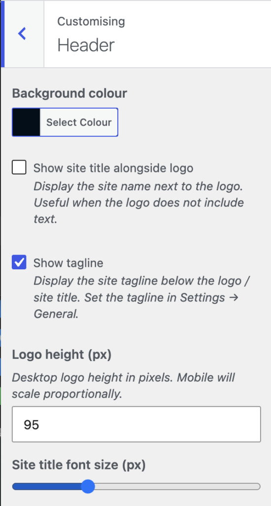
- Background colour: the colour of the header strip behind the logo, the main navigation bar below it, and the secondary navigation bar. The main navigation bar is the same colour, slightly darkened. The same colour is used for the header rows of tables in content. The default is near-black. Header text becomes black or white to suit.
- Show site title alongside logo: shows the site name next to the logo. Useful when the logo is a symbol with no words in it.
- Show tagline: shows the tagline under the logo. Set the wording in Site Identity.
- Logo height (px): how tall the logo is on a desktop screen, from 20 to 240 pixels. The default is 50. The logo scales down on smaller screens. A taller logo makes the header taller on every page, so keep it modest.
- Site title font size (px): the size of the site name when it is shown, from 14 to 48. The default is 24.
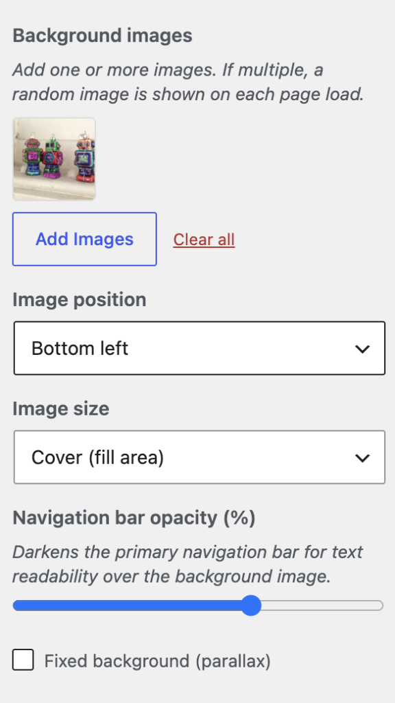
- Background images: one or more images to show behind the header and navigation bars. Select Add images to choose from the media library. If you add several, the intranet shows a different one at random each time a page loads. Drag to reorder and select the X on an image to remove it.
- Image position: which part of the image to keep in view when it is cropped: Centre, Top, Bottom, Left, Right or a corner. Use Top for a photo where the sky is at the top and the subject in the middle.
- Image size: Cover fills the header and crops the image to fit, which suits photographs. Contain shows the whole image and leaves space around it. Auto shows the image at its real size.
- Navigation bar opacity (%): how much the main navigation bar is darkened over the image, from 0 to 100. The default is 60. A darker bar keeps the menu readable over a busy photo.
- Fixed background (parallax): keeps the image still while the page scrolls over it. Phones usually ignore it and scroll the image with the page.
The header text colour is chosen from the Background colour, not from the image. If the image is light, choose a light background colour so that the text goes black. If the image is dark, choose a dark colour. A busy image makes the menu hard to read whatever you do, so prefer a photo with a plain area behind the logo, or a texture.
A header image is a good way to mark an occasion, such as an anniversary or a campaign week. Remove the images afterwards and the header goes back to the plain colour.
Footer
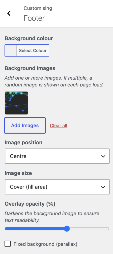
- Background colour: the colour of the footer. Leave it empty for the theme’s light grey. Footer text becomes black or white to suit.
- Background images, Image position and Image size: as for the header. Several images are shown at random.
- Overlay opacity (%): a layer of the footer background colour laid over the image, from 0 to 100. The default is 60. Raise it to fade the image and keep the footer text readable.
- Fixed background (parallax): as for the header.
Menus
The theme has two menu locations: Primary Navigation, the bar under the logo, and Secondary Navigation, the bar under that. You can build and assign menus here or under Appearance, Menus. See Setup menus.
Widgets
Every widget area in the theme is listed here: the homepage areas, the three footer columns, and a sidebar or landing area for each kind of content, such as the Task Sidebar and the News Landing area. You can add, remove and reorder widgets here with the preview beside you, or under Appearance, Widgets. See Available widgets.
Homepage Settings
A Govintra intranet uses a static page as its homepage, with the Home page template, so Your homepage displays should be set to A static page with that page chosen. Leave this alone unless you are rebuilding the homepage. See Update the homepage manually.
Additional CSS
Add your own CSS here for small changes the settings do not cover, such as a different font or a tweak to spacing. It is applied on top of the theme and is kept when the theme is updated. Keep it short and add a comment saying what each rule is for, because whoever looks after the intranet after you will find it here. For fonts and scripts, see Add custom fonts and scripts. Header code and tracking scripts belong in the intranet options, not here.
What is not in the customiser
- The login screen logo, the shape of card images, icon styles and the duotone icon colours are on the Style tab of the intranet options. See General intranet options.
- Category colours are set on each category.
- Dark mode is chosen by each member of staff, from the footer. There is no site-wide switch.
- Which parts of the intranet are switched on, such as news, events and the staff directory, is under Options, Modules.