
The Aggregator page template builds a page from blocks of content arranged in columns, in the same shape as the homepage. It was designed for team, department and directorate pages: one page that shows the team’s latest news, its people, its tasks, its documents and its events, all kept up to date automatically. Choose it in the Page Attributes box as described in Change a page layout, and the four column boxes appear below the editor.
How the columns are laid out
The main editor content, if there is any, appears first as an introduction across the full width. Put a heading in it: the template does not show the page title on the page itself. Below the introduction:
- Column 1 is the left half of the page and runs its full height. It is the widest column, so it suits news cards, team members and galleries.
- Hero column sits at the top of the right half, the full width of that half.
- Column 2 and Column 3 sit side by side under the hero column on a desktop screen, each a quarter of the page. On a tablet they stack. Use them for short lists: links, documents, upcoming events.
Empty columns take no space. On a phone everything stacks in the order Column 1, Hero, Column 2, Column 3. The Gallery block is only offered in Column 1 and the Hero column, because thumbnails need the width.
Add blocks to a column
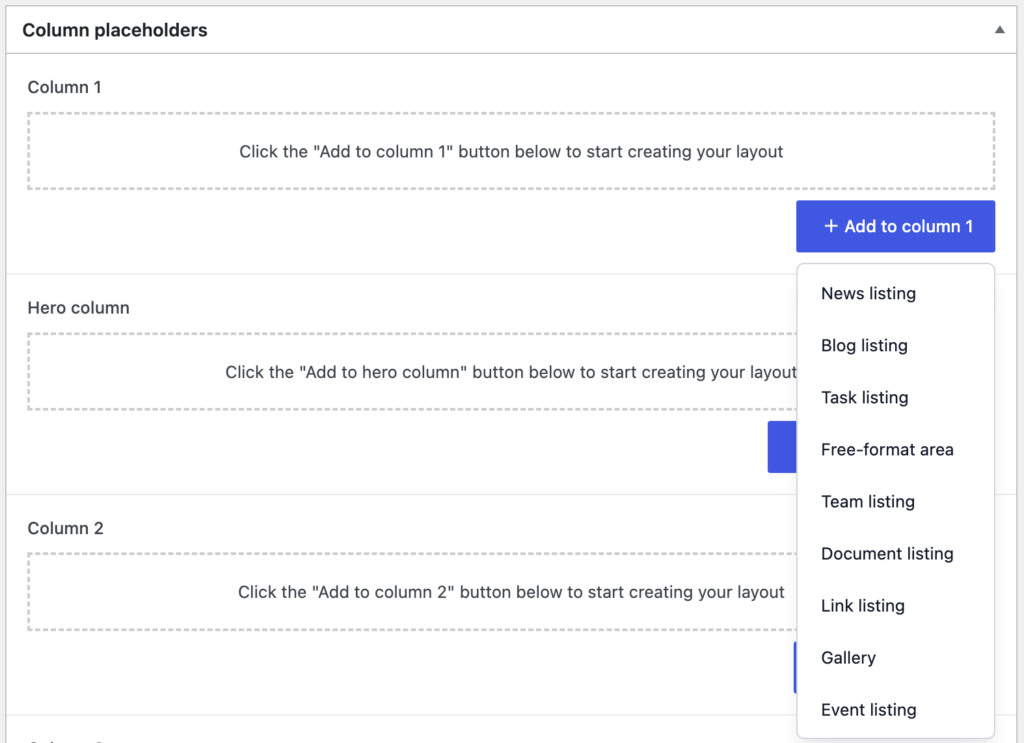
Each column box has a button, Add to column 1 and so on, that lists the blocks. Add as many blocks as you like to a column, in any order, and drag them to reorder. Every block has a Title that is shown as its heading; leave it blank for no heading. A block that finds nothing to show is left out of the page altogether, so an empty news listing does not leave a gap.
News listing, Blog listing and Task listing
These three show the latest items of that kind, filtered by the choices in the tabs at the bottom of the block. Every filter you set must match; within a filter, any of the chosen terms will do.
- Team (all three): items whose Related team is the chosen team or any team beneath it. This is the filter that makes a team page: pick the team and the block follows it.
- News type (news) and Category (tasks): one or more terms. See News types.
- Tag (news and tasks): one or more tags. See Learn how tags work.
- Need to know (news only): Include need to know is the default. Only need to know shows just the news stories marked as need to know; Exclude need to know leaves them out, for a page that already has the Need to know widget.
- Freshness (news and blog): a number of days. Items older than that are not shown. Leave it blank to show all.
- Number to display: how many items at most. Blank shows all that match, so set it.
- Compact list: off by default, which shows each item as a card with its thumbnail, date and excerpt. On, it shows a plain list of titles and dates, which is better in the narrow columns.
News and blog posts are shown newest first. Tasks are shown most recently updated first.
Team listing
Choose one Team. The block shows the team’s leader first, then everyone whose profile puts them in that team or in any of its sub-teams, ordered by the order number on their profile and then by first name. Each person appears as a card with their photo, name, job title and phone number, linking to their profile. For more control over people lists, use the people shortcodes in a Free-format area: see Find available shortcodes.
Event listing
Shows upcoming events, soonest first, starting from today. Choose a Team to limit it to that team’s events (including sub-teams), set the Number to display, and tick any of the Options: Calendar adds a date block beside each event, Thumbnail adds the featured image, and Location adds the venue and, for online events, a link to the meeting. Each event shows its date, start time and excerpt.
Document listing
Lists files from the media library, alphabetically, filtered by Category (tick one or more) and Type (one document type). With neither set it lists every file that has a document type. Categories and document types for files come from the Govintra Media A to Z plugin, so this block needs it: see Enable the Document Finder and Media A to Z.
Link listing
A plain list of links to pages, tasks, news stories and blog posts that you pick by hand in the Link box, in the order you pick them. Good for “Key pages” or “Forms” lists.
Gallery
Choose images from the media library. They are shown as a grid of thumbnails, three across, that open full size in a lightbox, with captions if the images have them. Column 1 and the Hero column only.
Free-format area
A full editor, like the main page editor, for anything the other blocks do not cover: a welcome message, a contact box, a video, a poll, a table, or a shortcode. Shortcodes work here, so a list of people or teams can be placed with the same shortcodes you would use on a page.
Aggregator or homepage?
The homepage uses widgets; an aggregator page uses blocks stored on the page itself, so anyone who can edit the page can maintain it without access to the Widgets screen. That makes the aggregator the better choice for pages a team looks after. See Home page template for the homepage.