
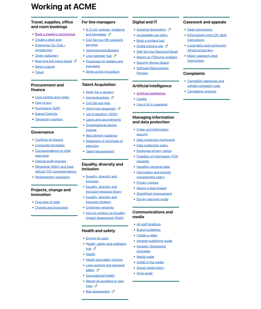
The Signpost template is for a page that points people to several places at once: a hub for a department, a “where to find” page, or a landing page for a programme. It shows the page’s own content first, then two, three or four rich-text sections side by side. Each section is a full editor, so a column can hold a heading, a list of links, a picture, a button or a shortcode.
Choose it in the Page Attributes box, under Template: see Change a page layout. It is available for pages only. Once chosen, a Signpost sections box appears under the editor.
The Signpost sections box
The box holds one setting and up to four editors, in this order.
Number of columns
Choose 2 columns, 3 columns or 4 columns. The default for a new page is 4. The box shows the matching number of section editors: Section 3 only appears with 3 or 4 columns, and Section 4 only with 4. A page made before this setting existed, with nothing chosen, behaves as 4 columns.
Section 1 to Section 4
One editor for each column, with the full toolbar and the Add Media button. Sections are shown on the page left to right in number order. A section left empty is skipped and the remaining sections share the width, so a four-column page with Section 3 empty shows three columns. If only one section has content it is shown across the full width.
Reducing the column count hides the higher-numbered sections but does not delete their content. Choose 4 again and the text is back.
What the page shows
From the top: the breadcrumb trail, the title, anything typed in the main editor, and then the sections in their grid. The main editor is the place for an introduction; leave it empty and the columns start straight under the title. Shortcodes and embedded video work in the sections just as they do in the main editor. A Heading 2 at the top of each section makes a good column title; it is shown a little smaller than a Heading 2 in the main content so that four fit comfortably.
The template has no sidebar. The Sidebar box is not displayed, widgets do not appear, and files added in the Document attachments box are not listed, so put any downloads in a section as links. Comments are not shown.
Phones and tablets
- Two and three columns stack one under another on screens narrower than 768 pixels and sit side by side above that.
- Four columns show as one column on a small phone, two by two from 480 pixels, and four across from 1024 pixels.
Sections are always read in number order, so put the most important column first.
Tips
- Keep sections a similar length. A long column next to three short ones leaves empty space.
- Use a bulleted list of links in each column rather than paragraphs; the page is a signpost, not the destination.
- For a hub that pulls in latest news, events or tasks automatically, look at the Aggregator page or Comms hub templates instead. For a single wide column, use Full-width page.
- All the other templates are described in Available templates.